Payout ETA
Lyft pays drivers automatically every week. The most common question drivers ask support is some version of where is my money, and the app had no answer. A payout appeared in the bank when it appeared, and until then the driver was guessing.
The brief came from Lyft’s PII team (Payments, Identity and Integrity) as part of their end-to-end payouts initiative: design a simple, intuitive way to show the progress and expected arrival of a weekly payout. Four weeks, embedded with their engineering, product and content design.
The numbers behind the question
Weekly payouts, Lyft Direct and Express Pay together drove three quarters of all payouts-related support volume. Nearly one in five payout tickets was a status enquiry, and about 70% of those were one status in particular: deposit pending. Drivers were not reporting problems. They were asking for a timeline.
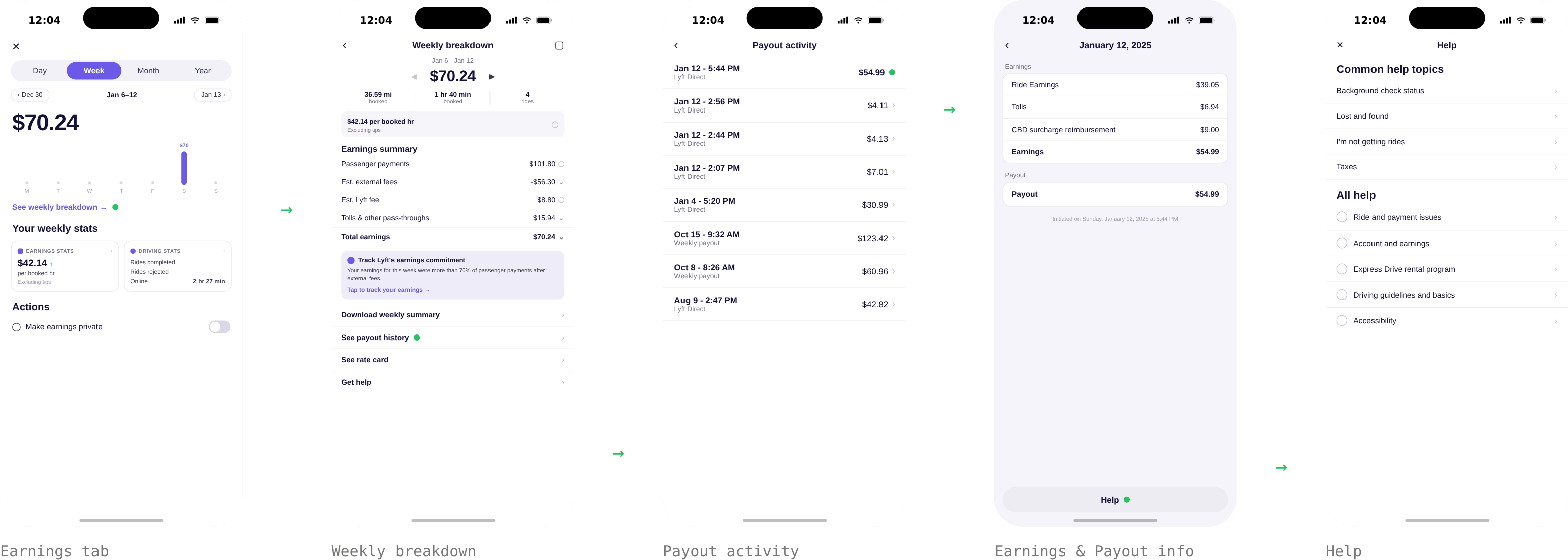
The page that could have answered them, payout history, had 5% adoption. When something felt off, drivers opened the Earnings tab first, because money means earnings. It had no payout information at all.
What drivers said
Three insights shaped everything that followed. Trust: the AI support assistant felt generic, never about their specific payout. Terminology: payment, earnings, payout and deposit read as the same word, and many drivers are not native English speakers; the vocabulary itself was causing tickets. Access: drivers looked in the Earnings tab first, and the answer lived somewhere else.
So the goals wrote themselves. For drivers: show payout status clearly, where is my money, and when does it land in my bank. For the business: reduce the high-volume support contacts that a missing timeline was generating.
Working with the data that existed
First conversation with engineering: is there ETA data? No. The payment provider offers an arrival_date, a date with no hours, which ignores bank-side processing, and which is not guaranteed stable once a payout is initiated.
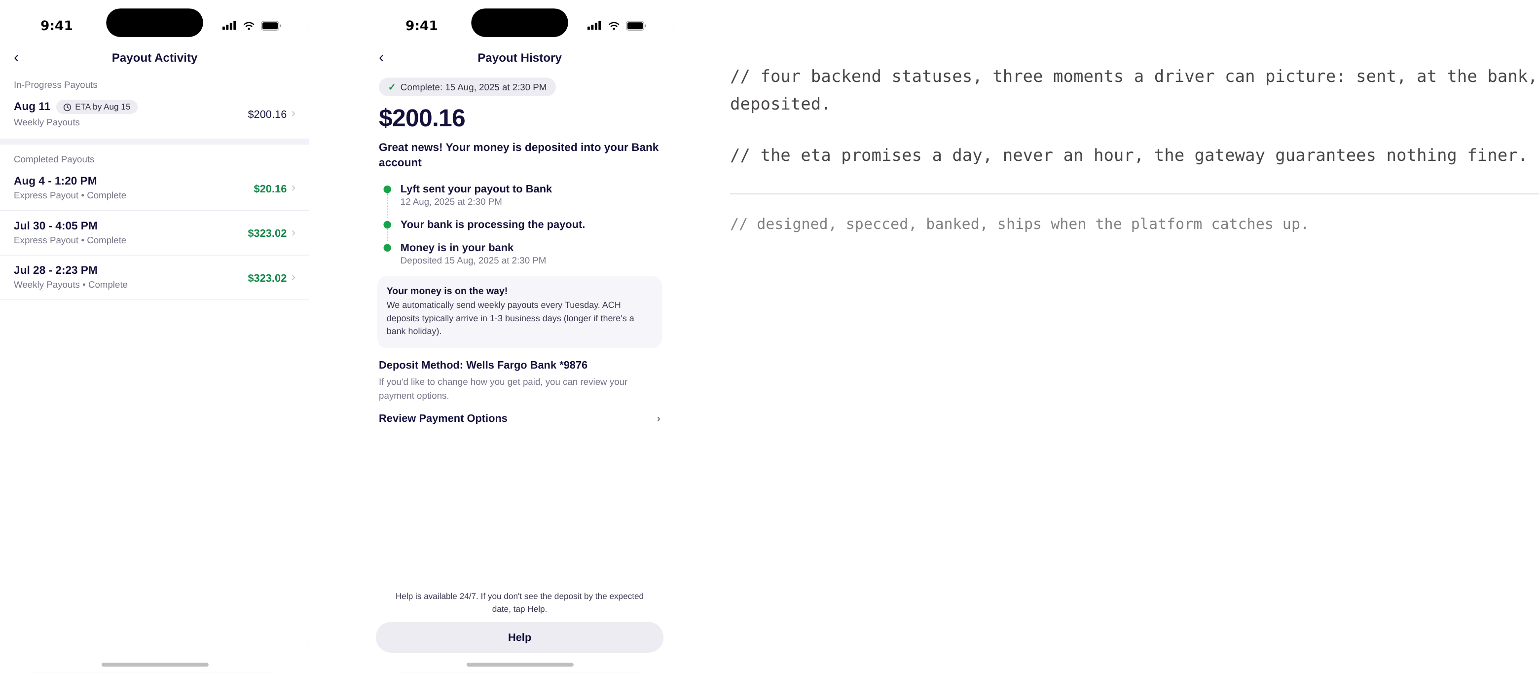
What did exist, reliably, were four transaction statuses: created, processing, processed, paid. Those four system states became the design foundation: translated into three driver-facing steps, written in plain language, with the ETA carried inline.
The constraint that shaped the ship
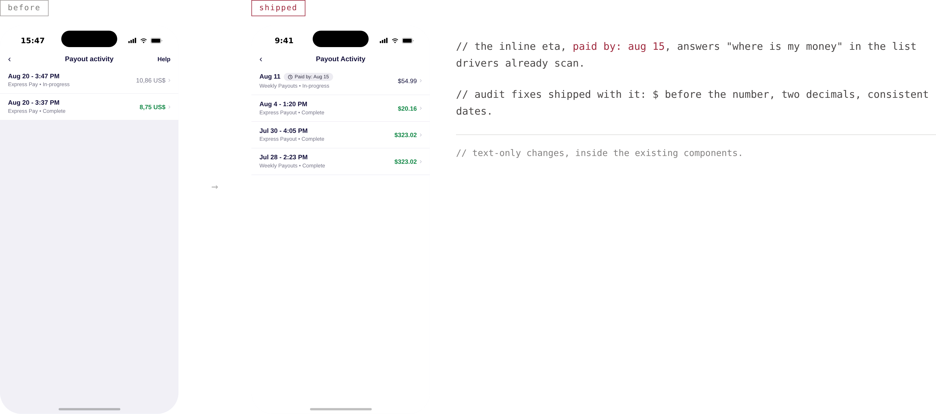
Then the scope met reality, twice. Months earlier, fetching arrival_date from the payment gateway had caused latency spikes, timeouts and 503s, the emergency fix was to disable those requests entirely, and no long-term solution existed yet. And the payout screen itself was nine years old, never updated, with no component library behind it. Engineering’s answer for the first milestone: text-only changes. No new components.
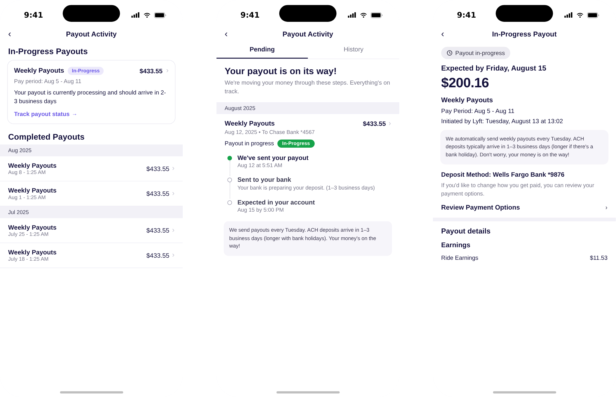
So I asked the team, what can we do? The answer became the design: inline ETA text, empathetic status copy, and standardised formatting, delivered entirely inside existing components. The visual tracker and the pending/history tabs were designed, specced and banked for the phase where the platform catches up.
The audit that paid for itself
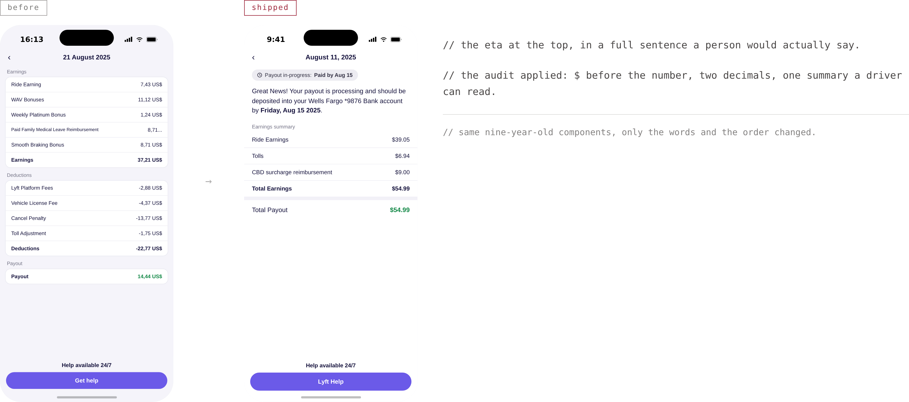
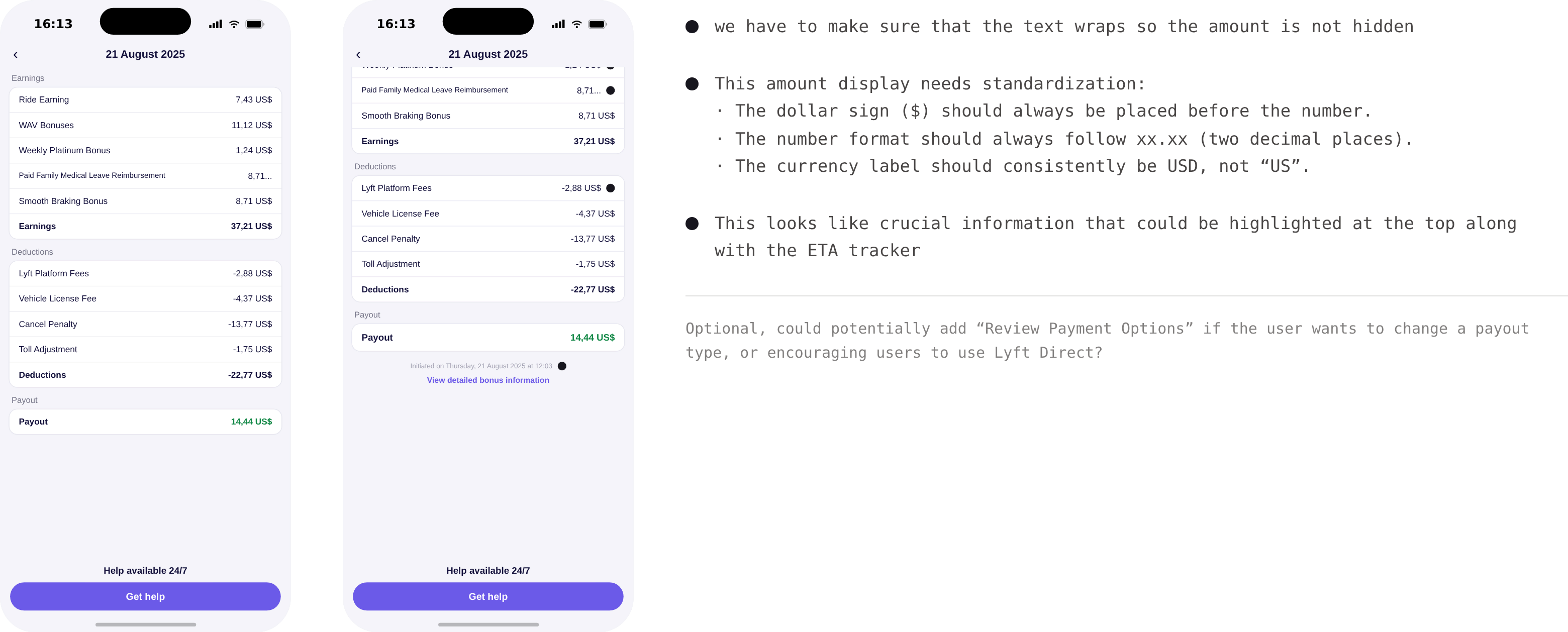
Auditing the existing screens surfaced the quiet errors drivers see fifty-two times a year: amounts truncated instead of wrapped, the dollar sign drifting after the number, inconsistent decimals, a currency labelled “US”. The fixes are unglamorous, $ before the number, always two decimals, USD, and they moved the crucial information, amount and ETA, to the top of the page.
Final design
The ETA now lives in both places drivers look: inline in payout history, payout in progress: paid by Aug 15, and in the payout detail, in a full sentence a person would actually say. Pending payouts were separated from history, because a payout that has not arrived is not history yet; each section carries one purpose, so a pending amount can never read as already paid.
Outcome
What I keep from this one: scope went from a full visual tracker to text-only changes, and the shipped version still moved the number, the job is finding the best solution inside whatever constraints you are given. Early engineering collaboration and weekly design reviews are what made that possible.
There is a companion essay about this space, designing for money you have already earned.