LA Metro Customer Experience Hub
A public-facing hub for Metro’s customer experience programme, what riders asked for, what changed as a result, and how the agency is measuring itself.
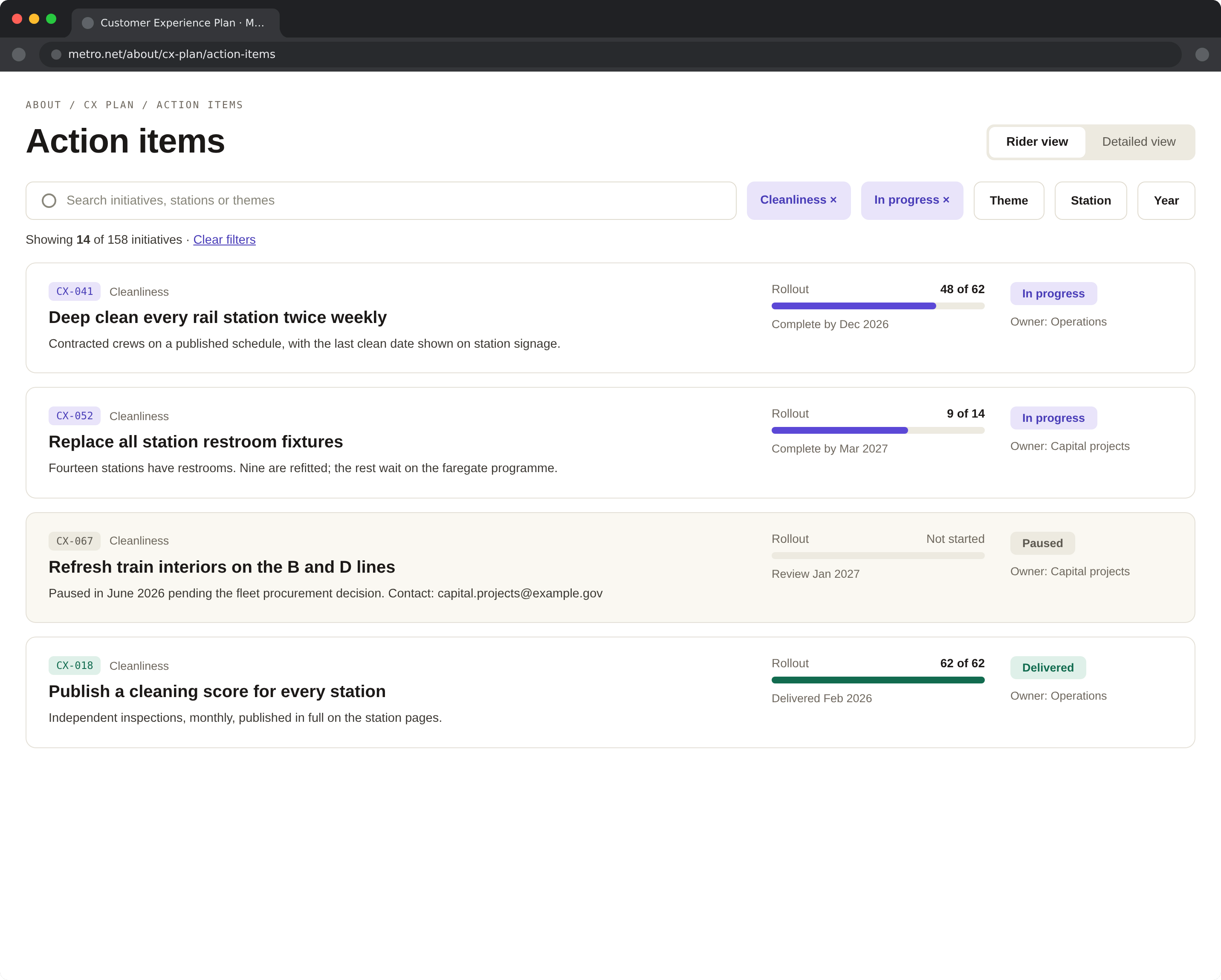
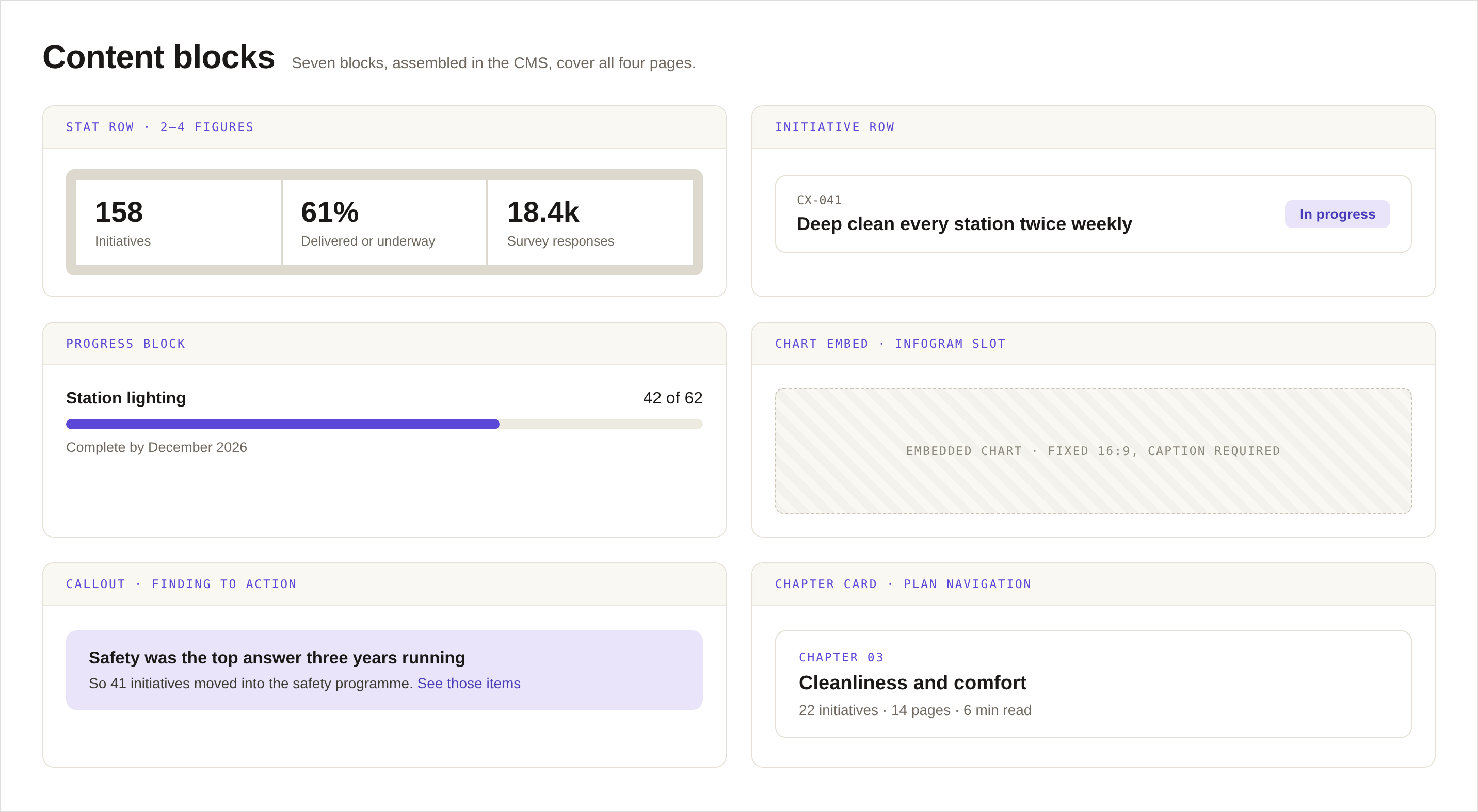
It is also a CMS project. Whatever I designed had to be maintainable by a small communications team with no front-end help, which meant a small set of modules that cannot be combined into something ugly.
One page, three questions
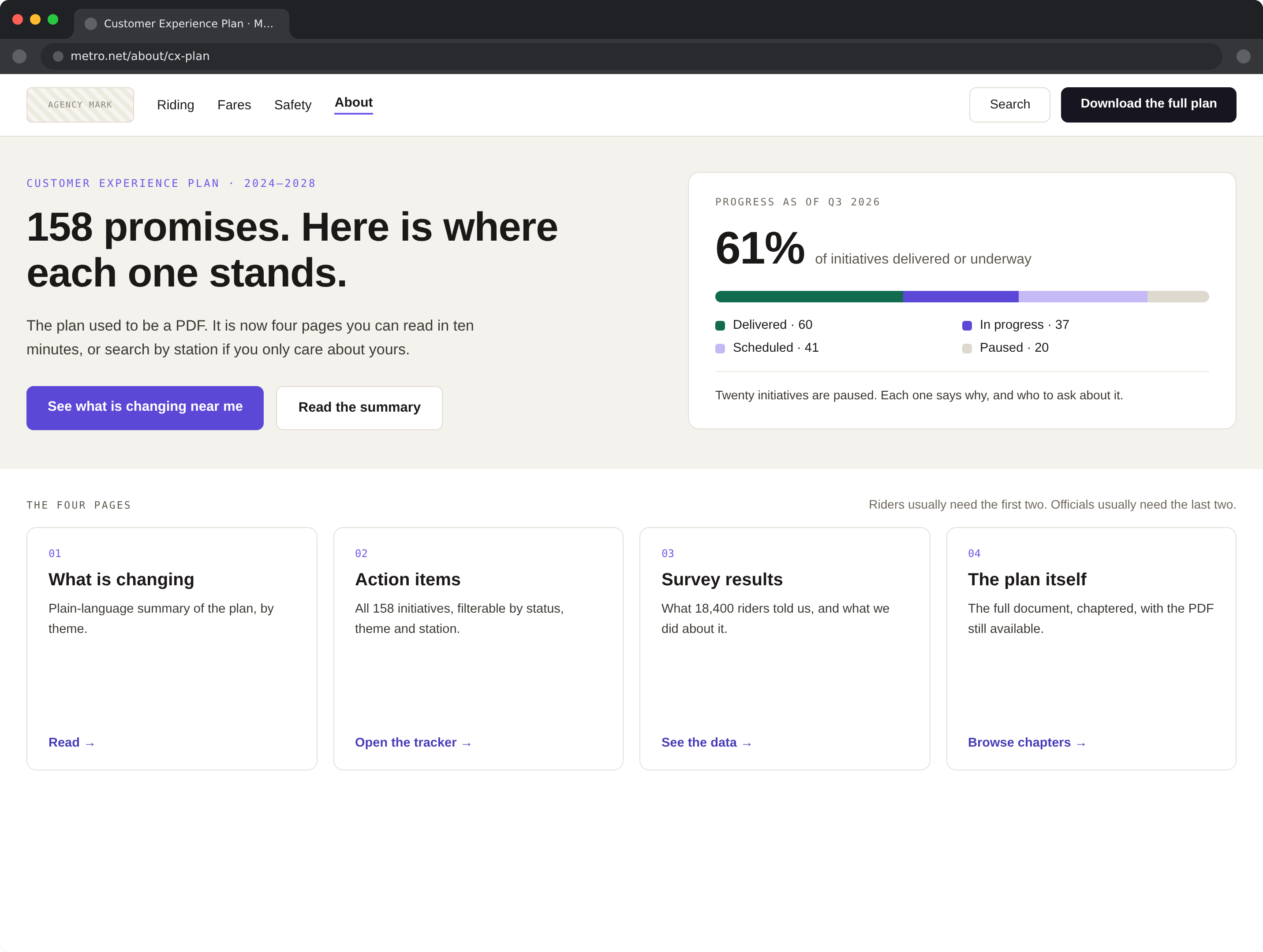
Every page in the hub answers the same three questions, in the same order: what riders asked for, what changed because of it, and how the change is being measured. When an agency reports on itself, structure is credibility, the asks come from riders in their own words, the changes carry dates, and the measurements carry their methods.
That ordering was deliberate. Leading with the riders’ asks makes the page an answer instead of an announcement. A customer experience programme that opens with its own achievements has already lost the reader it exists for.
A module library, no free-form page builder
I gave the team a small library of blocks with fixed internal spacing and no colour choices. Each one has a written rule about when to use it. Long after launch, the page still looks like the design, which is the only design-system metric I actually trust.
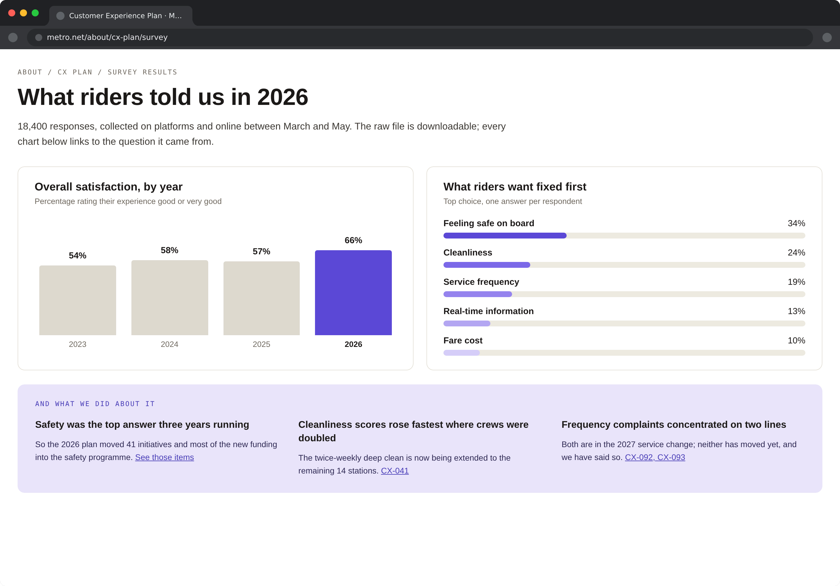
The survey results module was the most negotiated: leadership wanted a headline satisfaction score, and riders in testing did not believe a single number from the agency grading itself. We shipped the score with the sample size, the question wording, and the field dates next to it. Belief went up.
Accessible because it is public
A transit agency’s website is used by exactly the people accessibility guidelines were written for, so AA is the floor, not the ceremony. The guarantees live inside the modules rather than in a review at the end: contrast is baked into the module tokens where authors cannot break it, the heading structure reads correctly aloud, and the survey charts state their point in a sentence before they draw it.
The same thinking applies to language. Plain sentences over programme jargon, because “customer experience initiative” is not a phrase any rider has ever said out loud.